Client
- abacaxi
Services
- Branding
- Strategy
- Website design
- Website development
Credits
- Photography is from abacaxi
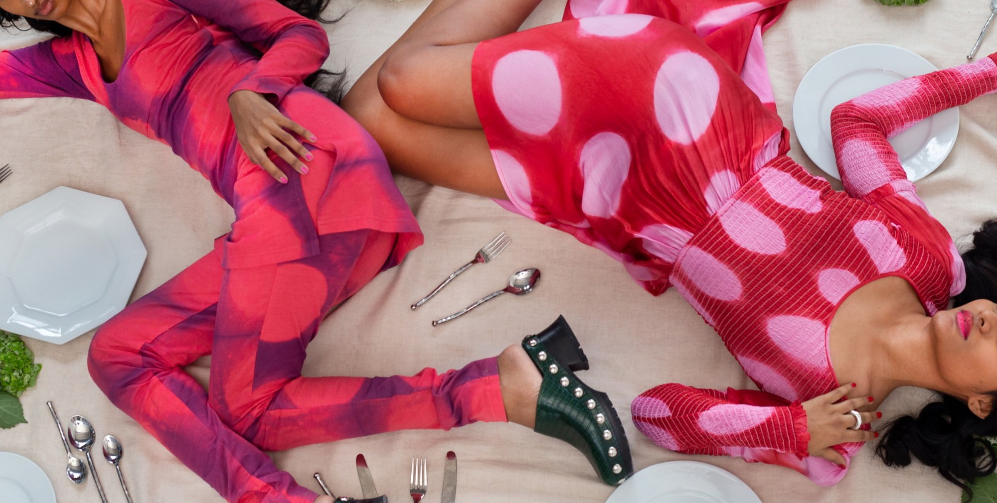
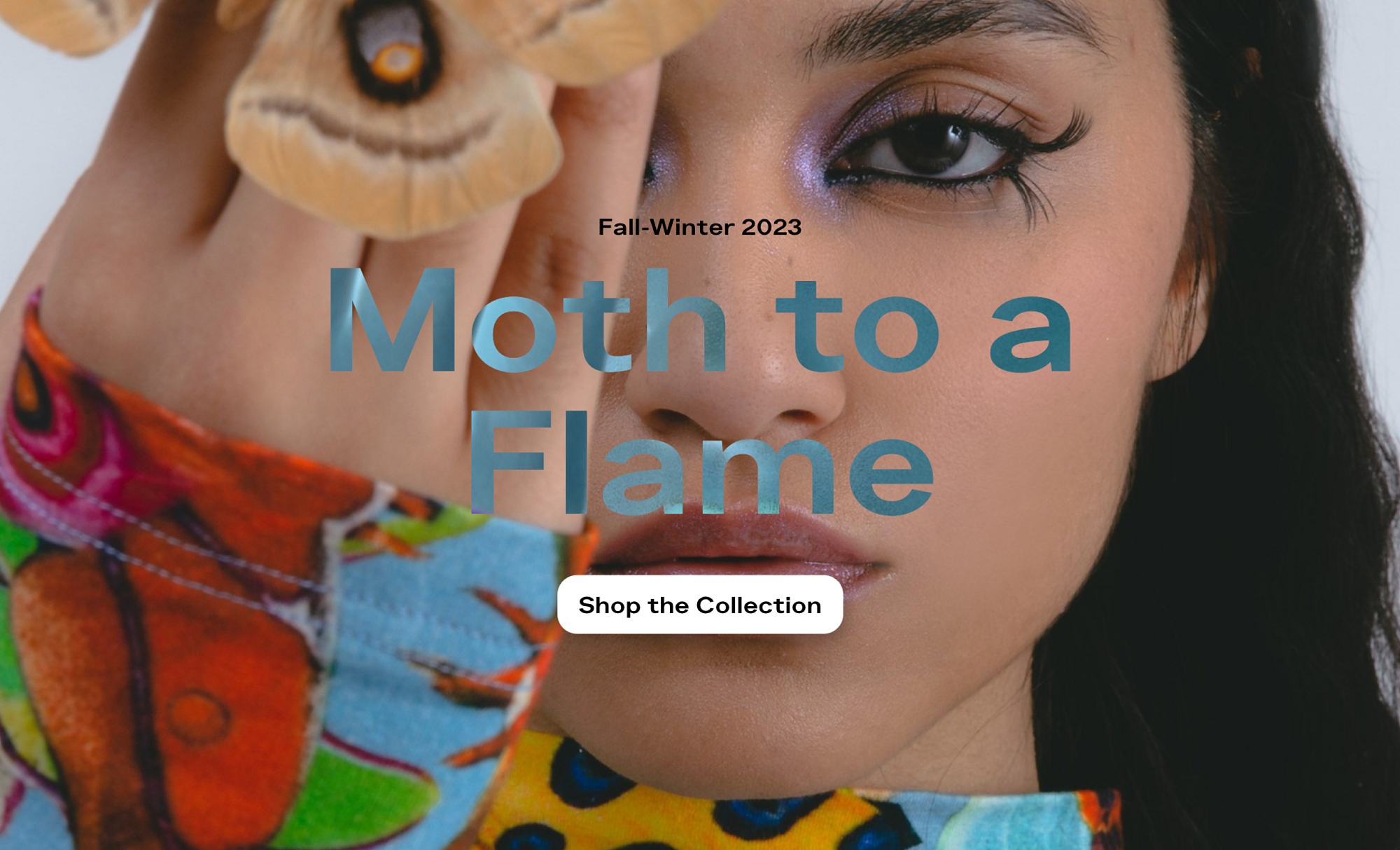
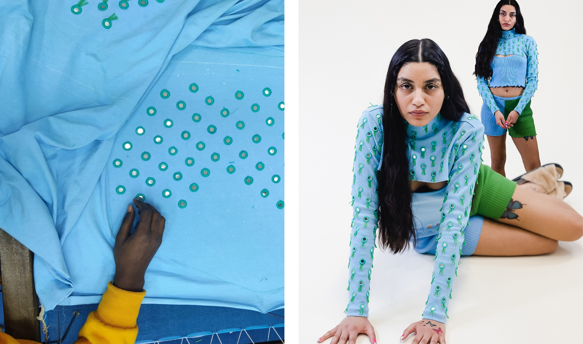
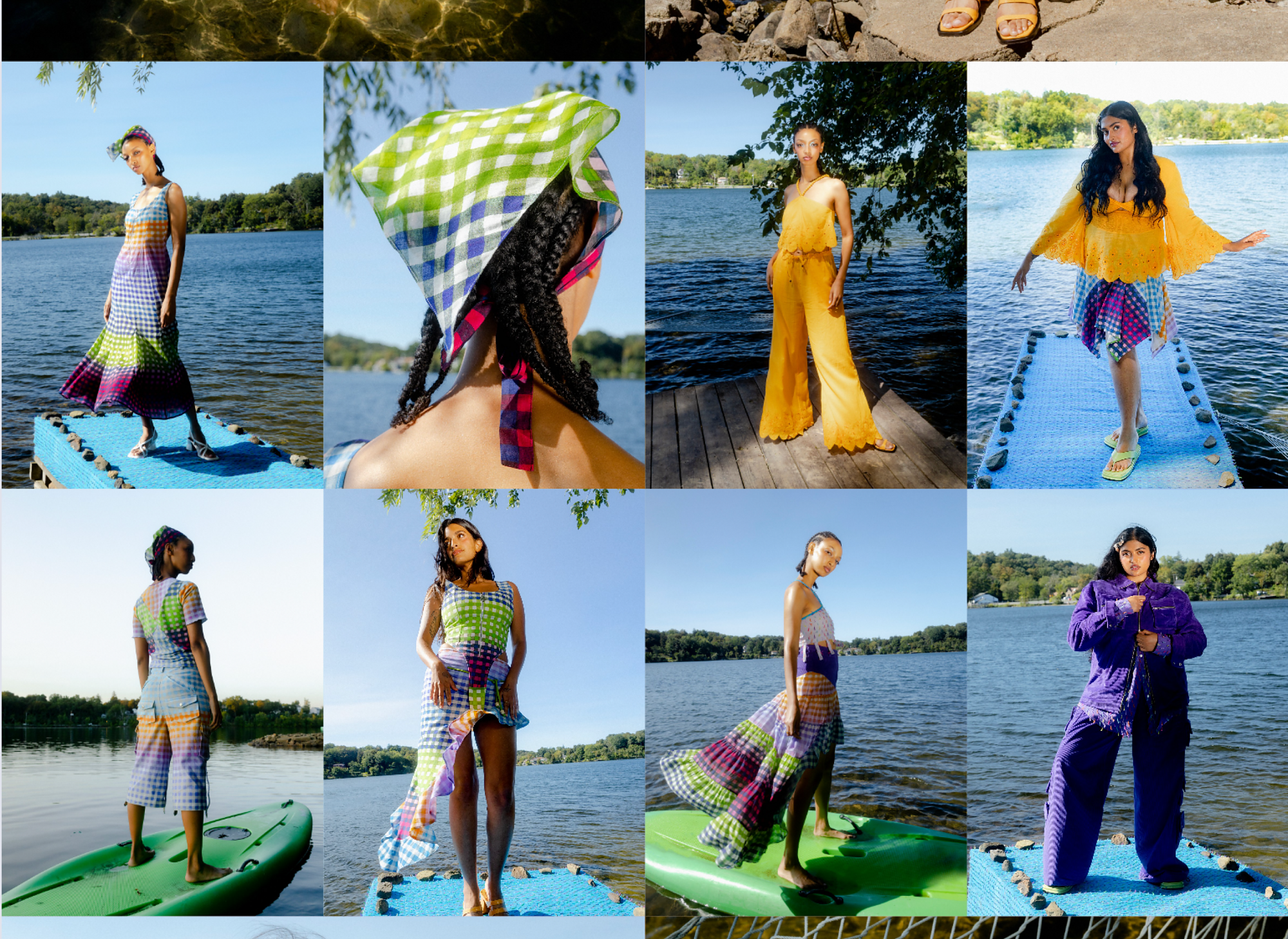
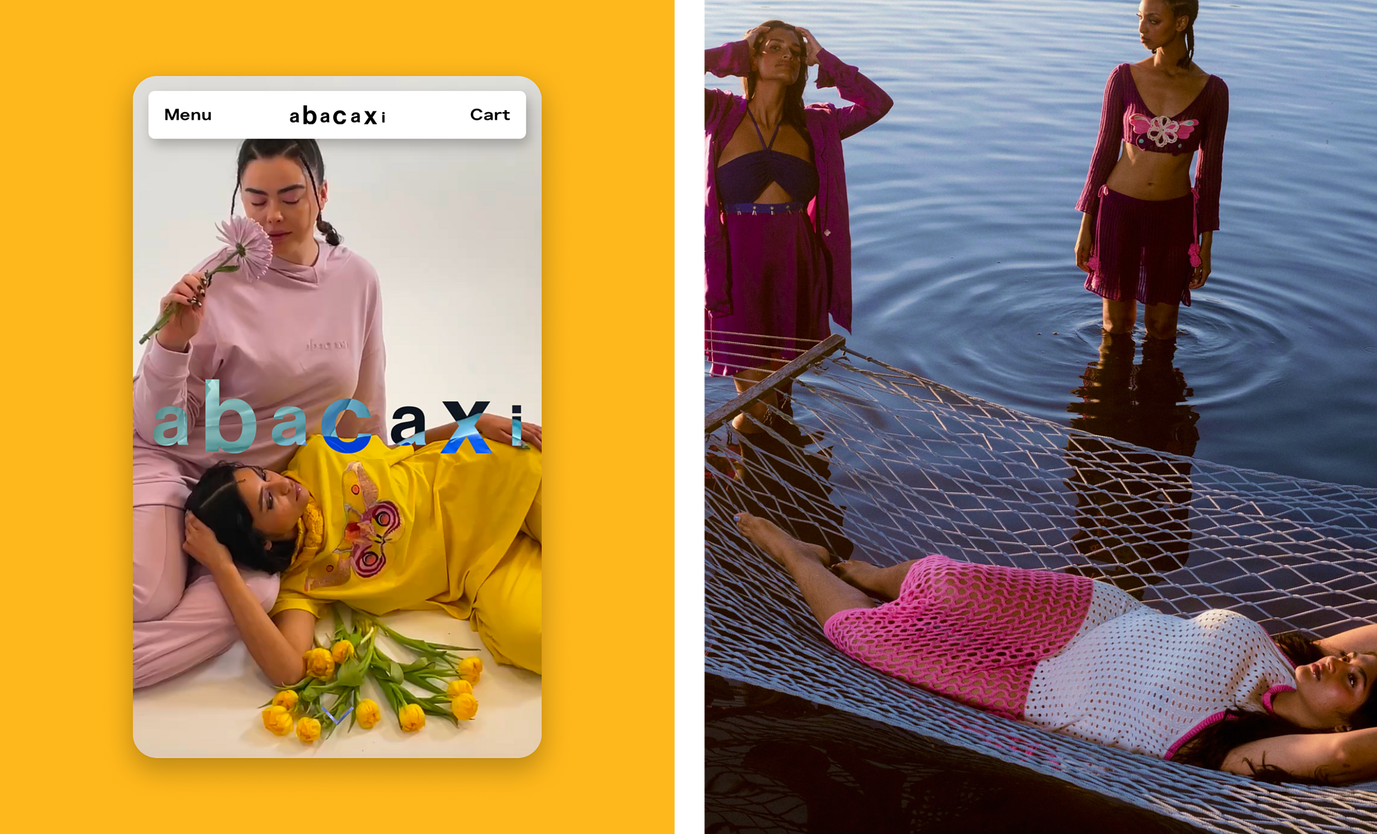
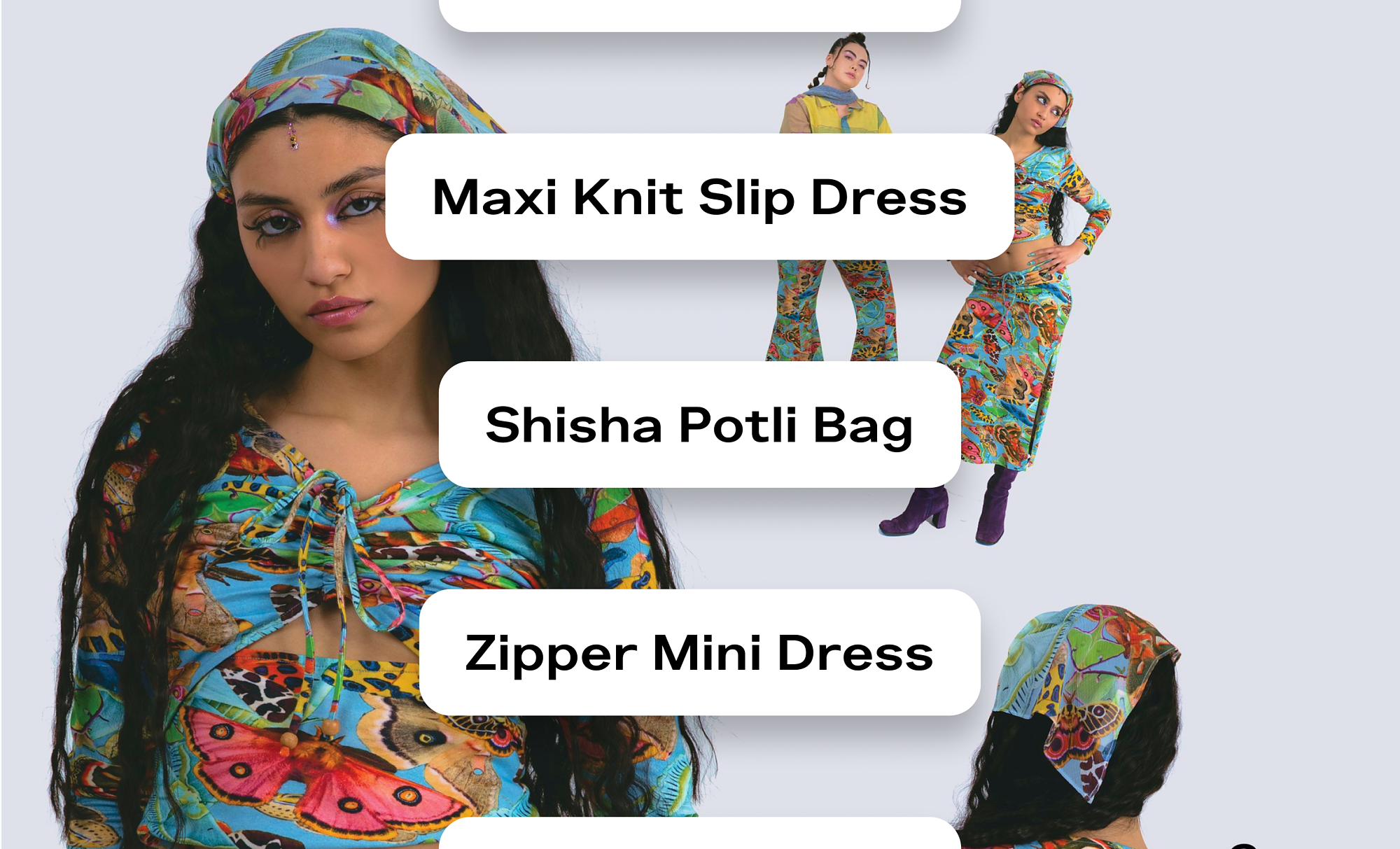
Abacaxi is a fashion company founded by designer Sheena Sood. The brand’s name, which means “pineapple” in Portuguese, reflects an eclectic mix of the designer’s early experiences: from growing up in Detroit in the early 2000s to traveling with her family and celebrating her South Asian heritage. abacaxi brings all of these influences to life in full technicolor glory.
What we loved most about Sheena’s practice was the evocative and sensual way she described everything, from the slow production process to the styling of the garments. Throughout the branding process, we developed the concept of “audible poetry” to bring her voice to life, both literally and figuratively.
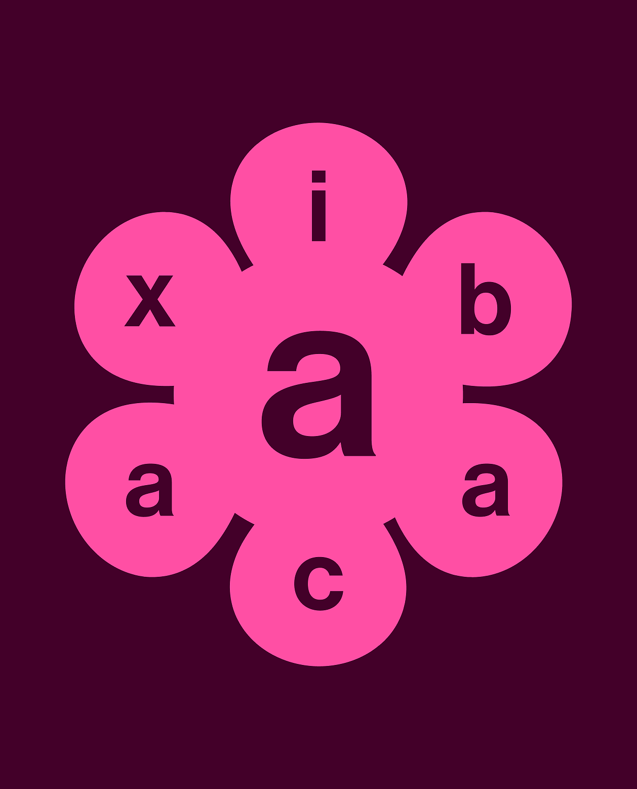
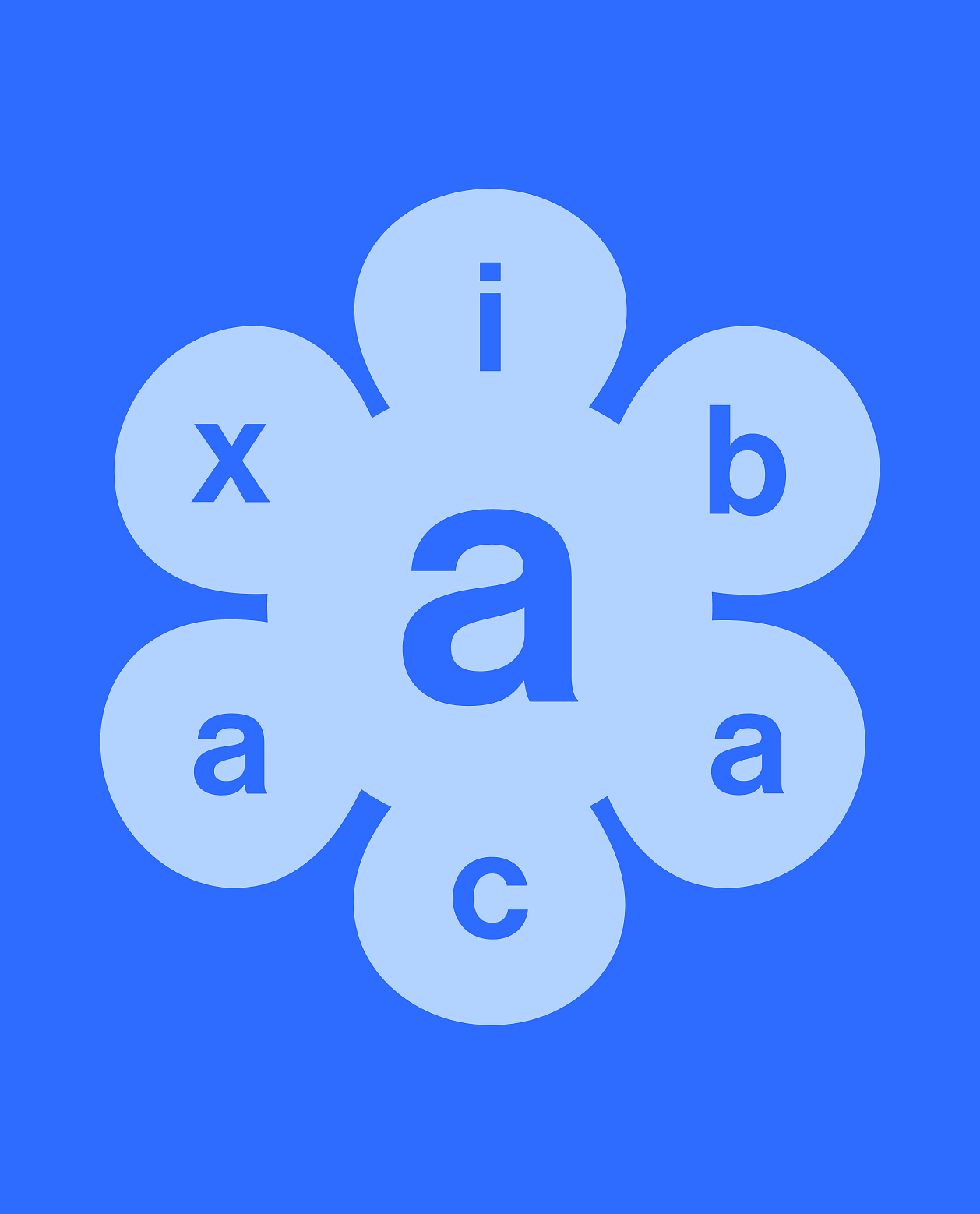
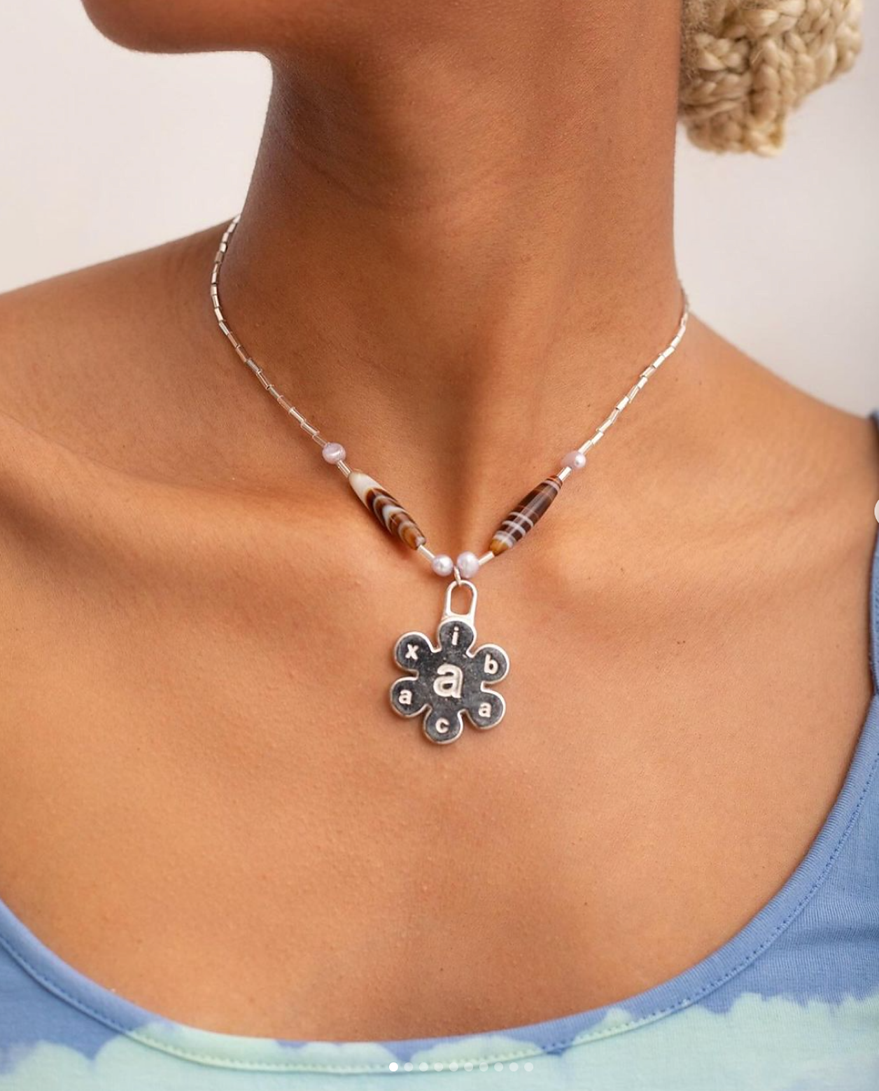
The abacaxi logotype is a customized treatment of Haas Grotesk, a ubiquitous typeface that is strong and versatile. The logo is set in lowercase, while alternating letters are magnified, subtly hinting at motion and audio, encouraging viewers to sound out the word. The abacaxi logotype reflects the brand concept of “audible poetry.” The logotype has an alternate use which flips the scale of the alternating letters.
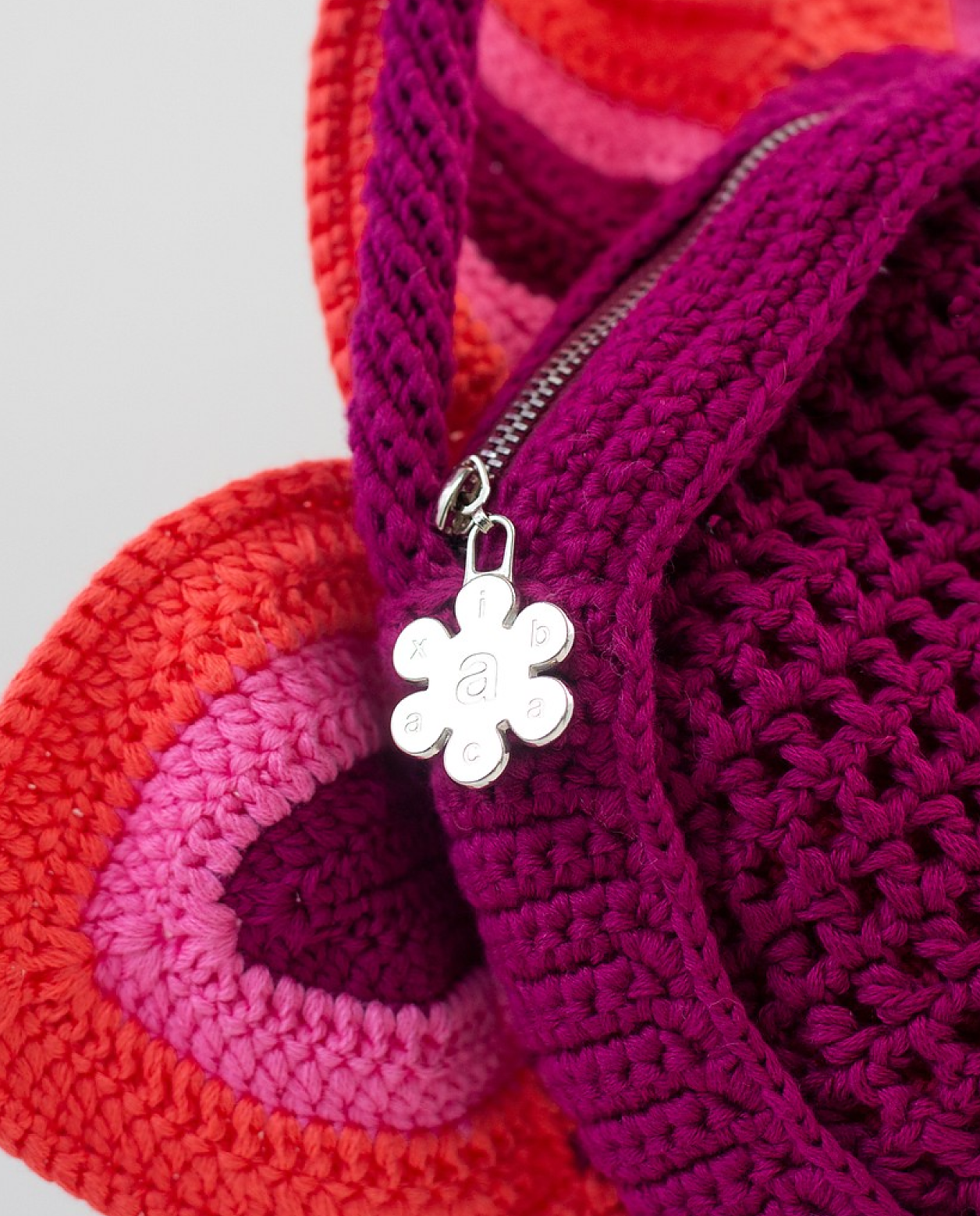
We also designed a monogram, loosely inspired by both Y2K styling as well as South Asian marks, like a bindi or a mandala. The monogram can be used as a 3D asset, too. The default color is metallic chrome, however the monogram can be tinted in colors that reflect the application like on the website.
We loved the musical and sensory way founder Sheena describes the products and seasonal processes. Both in writing and videos, the abacaxi brand feels lyrical and descriptive. We also like that the back story is about remembering trips, memories, and people from several moments in time and a range of cultures.
Anchoring our approach in this sensibility, we developed interactive moments that amplify abacaxi’s poetic storytelling. By integrating audio, typography, and visuals, we created a rhythmic experience that brings each product’s story to life.