Undies for Everyone
Jonesy New York is an intimates brand that merges vintage silhouettes, simplicity and social commitment. Hitting a rare mark between trend and timeless design, we sought to create a polished system that highlighted the diversity of her audience and celebrated her updated basics.

Updated Classics

We wanted to highlight the push and pull between classic and contemporary throughout the branding. This was realized in the logo and type system which used a 1970s-evoking display font called Windsor. The large type is used as a main graphic element throughout the site and on elegant micro-animations at necessary moments.
To avoid being too referential, we let the display typeface shine and used a pulled back color scheme, a system of more legible body typefaces and layouts that emphasized usability.

Usability

Usability extended to the site’s backend, too. Built on Forest, our custom ruby on rails CMS, we created several intuitive features to help the client maintain and encourage our design intentions. One such feature is the collage photo layout maker, which allows the client to create systemized collages throughout the site
Product Photos as Graphic Elements

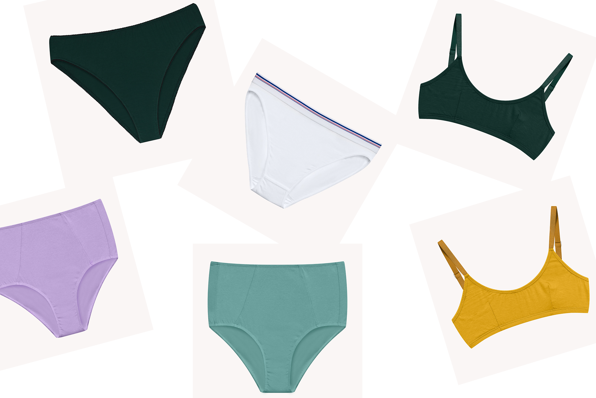
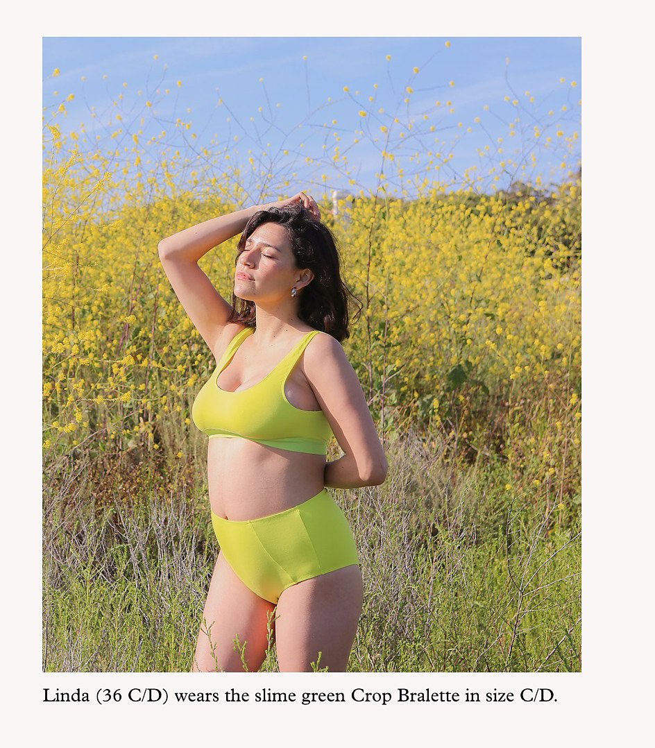
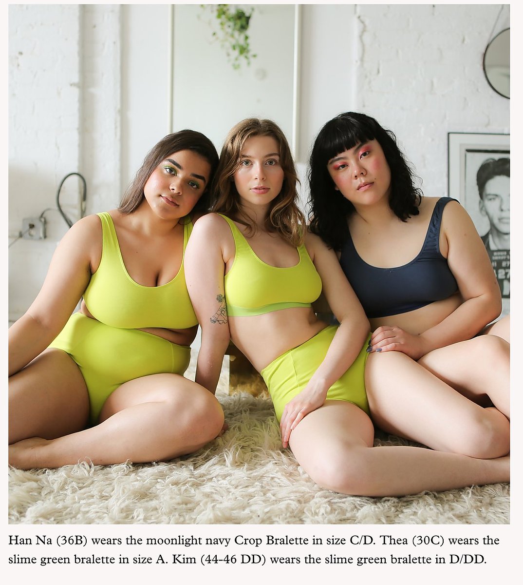
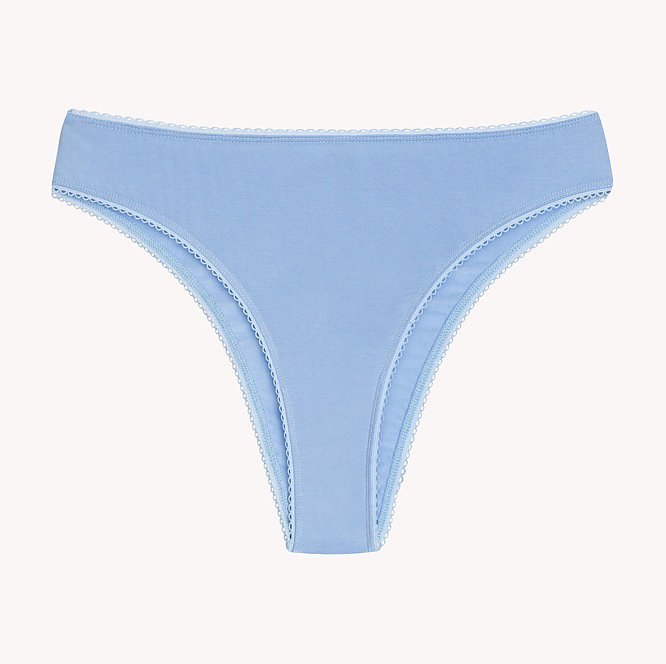
We art directed a set of e-commerce product shots and strategized the use of Jonesy’s exceptional editorial imagery to highlight the wide range of body types Jonesy appeals to.
Bookending the shopping experience, we created a set builder that encourages users to experiment with different products and colors, adding a layer of customization to the brand.
Jonesy maintained a breadth of exceptional editorial photography. We strageized the usage of these assets and combined them with more straight forward product shots in the shopping pages.

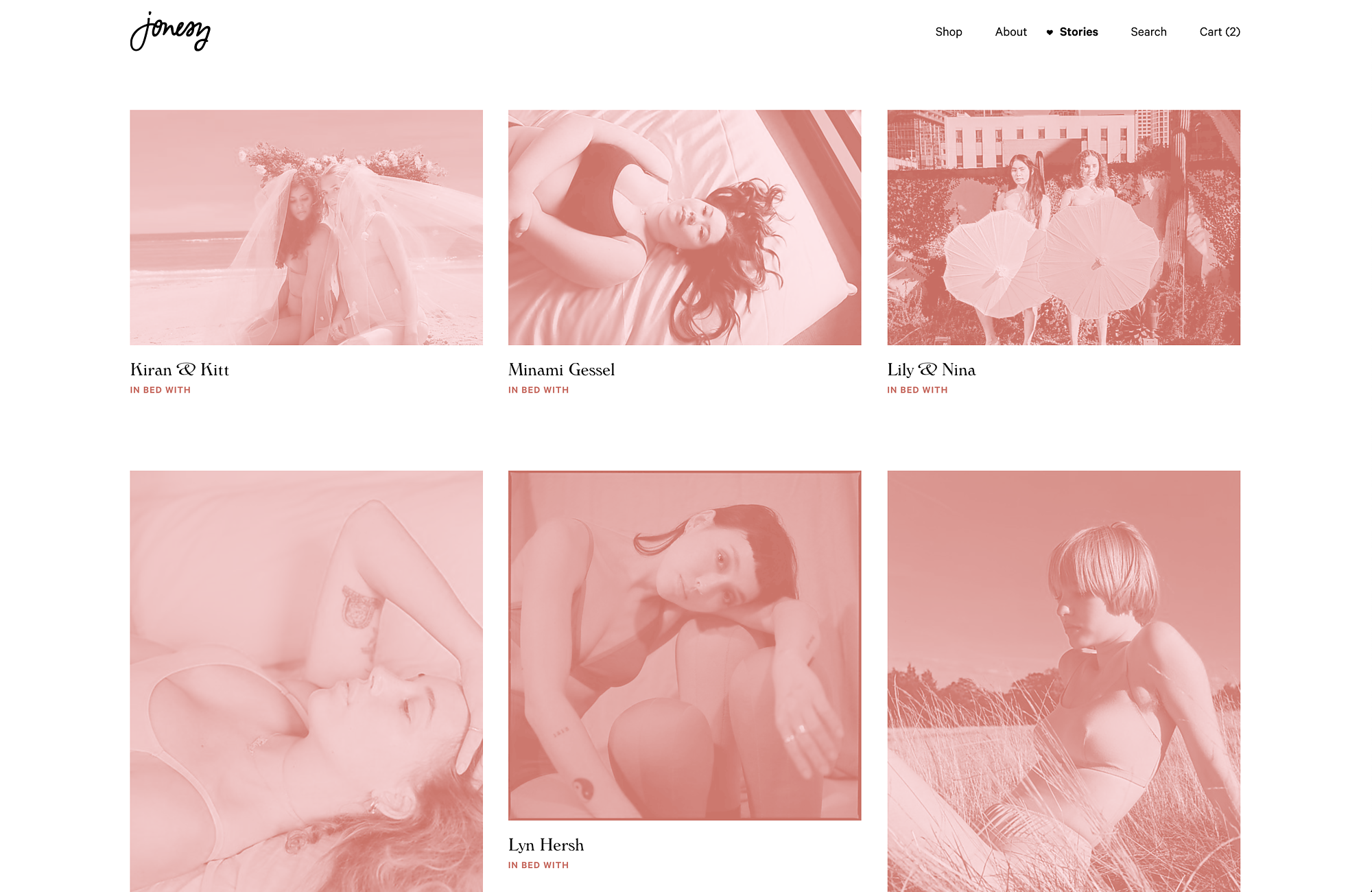
Stories

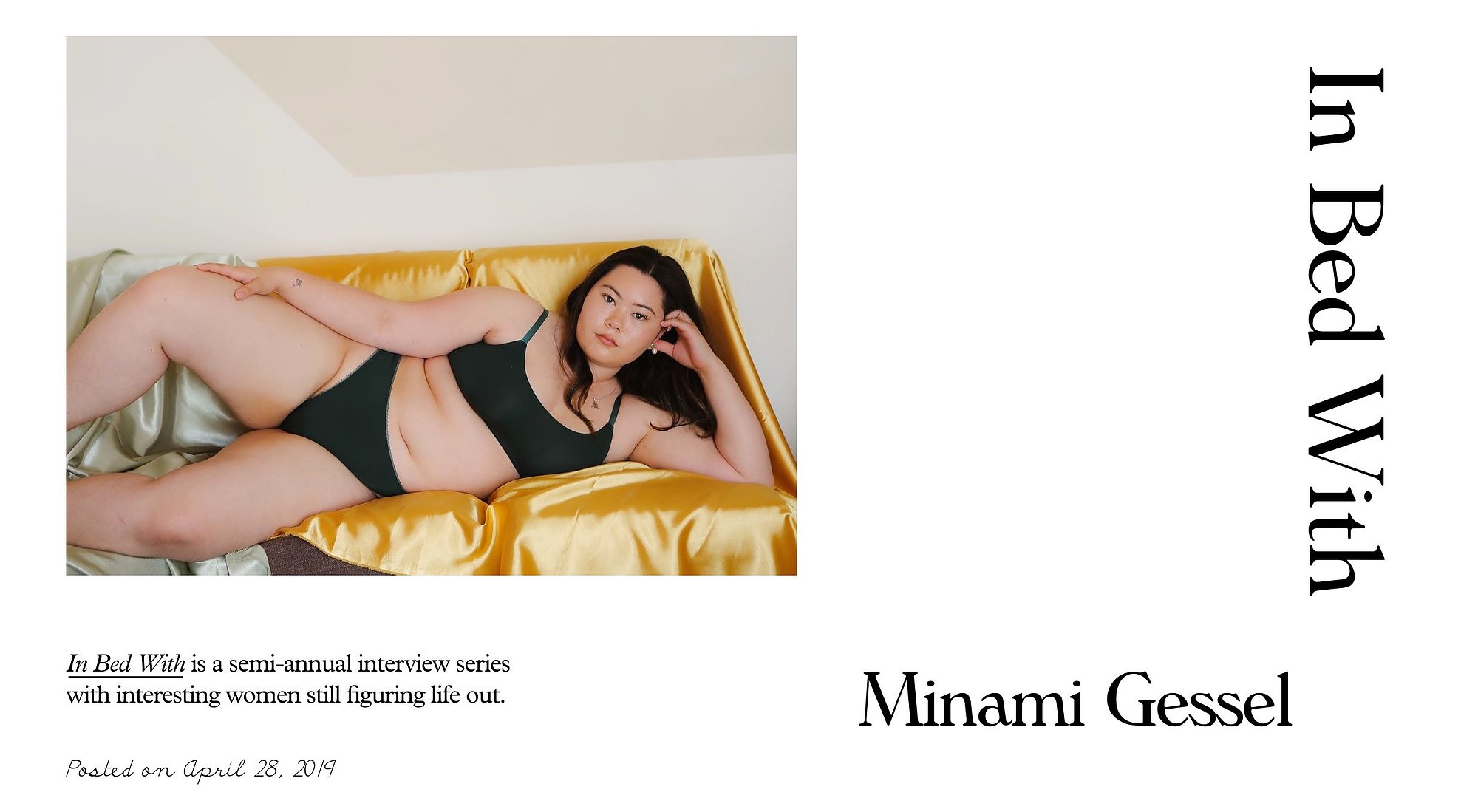
We also created a home for long form editorial posts called Stories. Stories housed look books, press and Jonesy’s interview series called In Bed With.