Client
- Open Style Lab
Services
- User Experience
- Website Design
- Website Development
- Art Direction
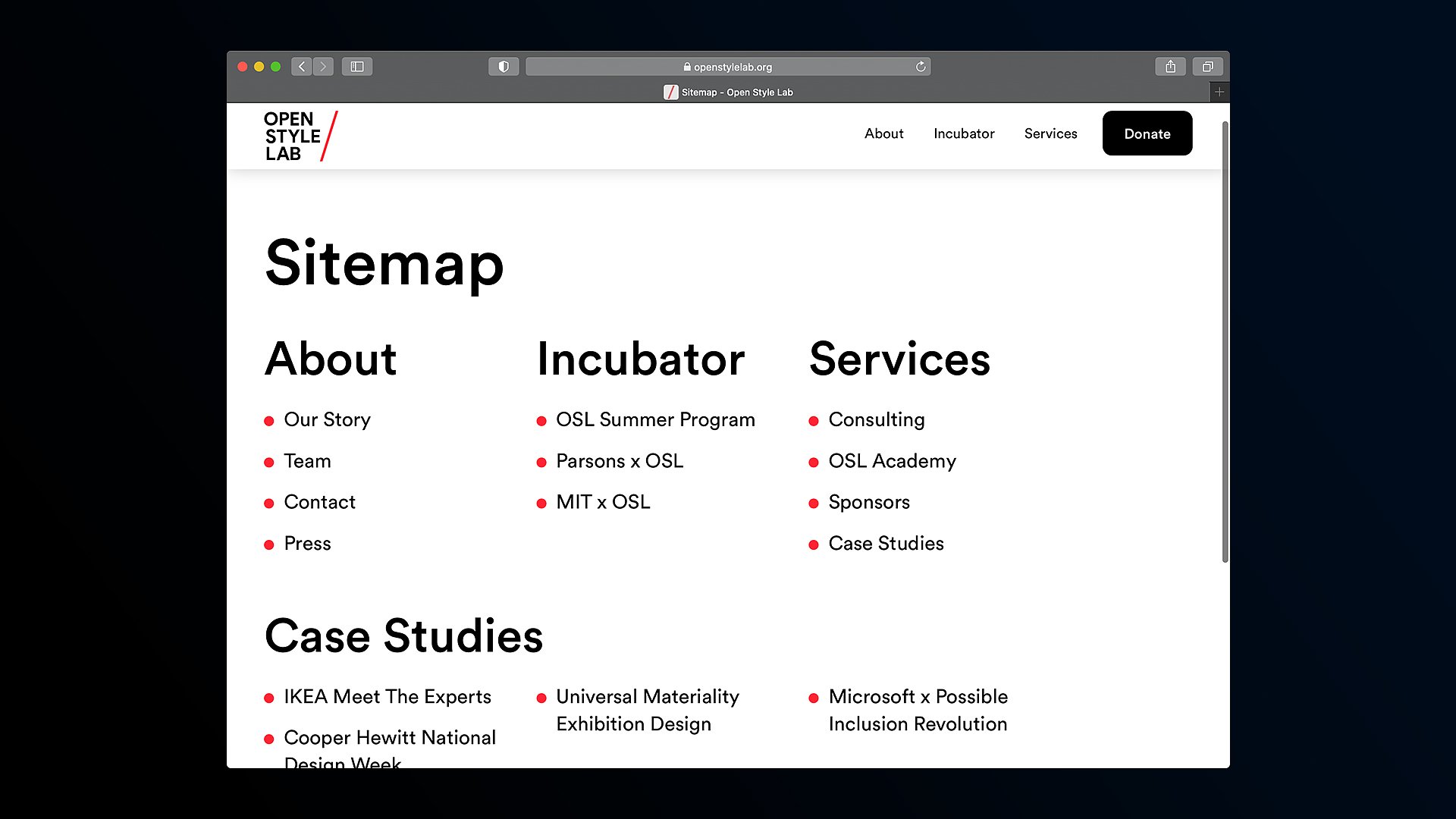
Because Open Style Lab is directly focused on supporting an organization commited to accessibility, we used it as an opportunity to reflect on what factors go into creating a clear and intuitive experience for the largest audience. Through our research, legibility, scale, and language became prominent themes in the design that helped ease of use across different audiences.
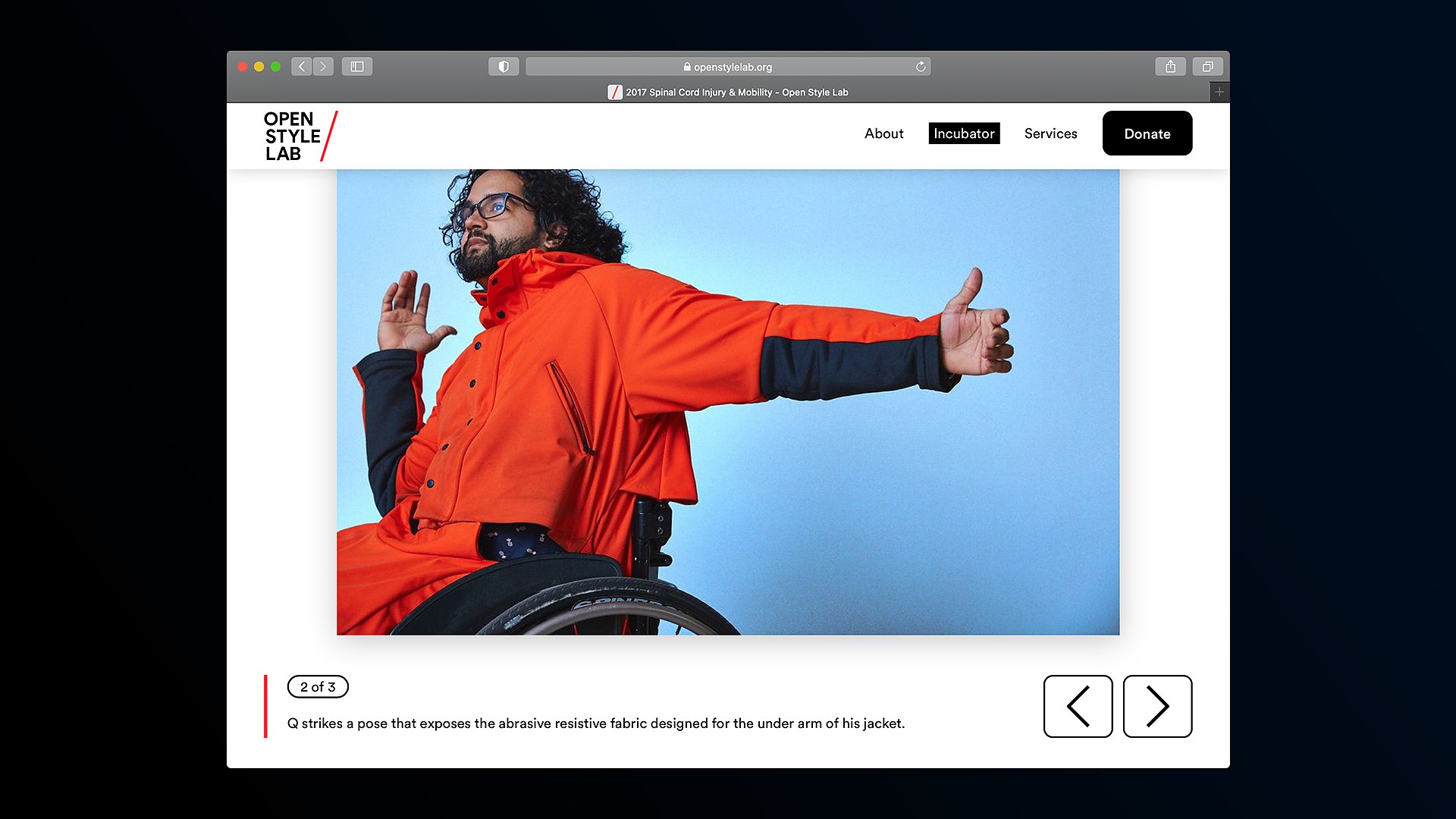
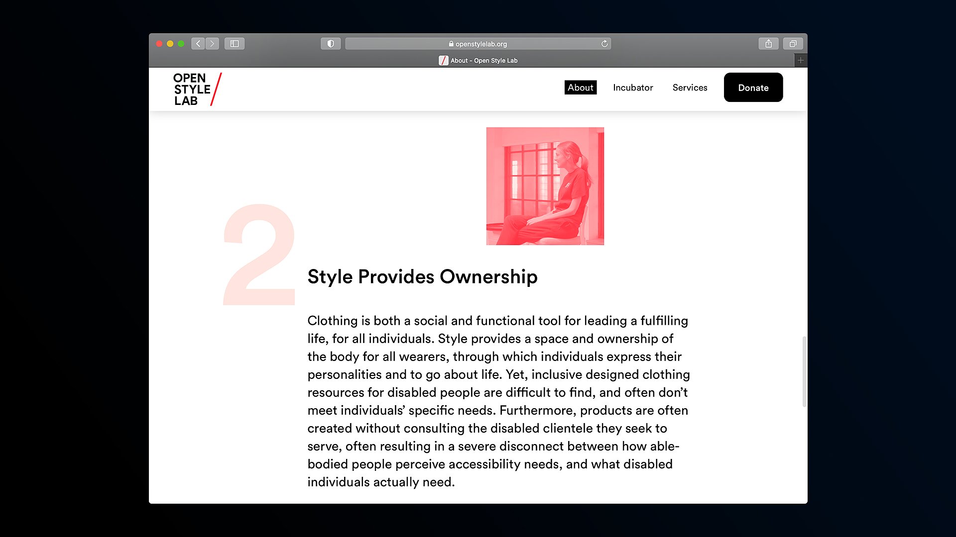
We noticed that many accessibility tools allow for zooming in to parts of an interface, so we wanted OSL’s design language to remove that need and feel adequately magnified, which became a central component to the visual language. The large-scale motif was integrated throughout the huge typography, the size of the imagery, and interface elements across the site.
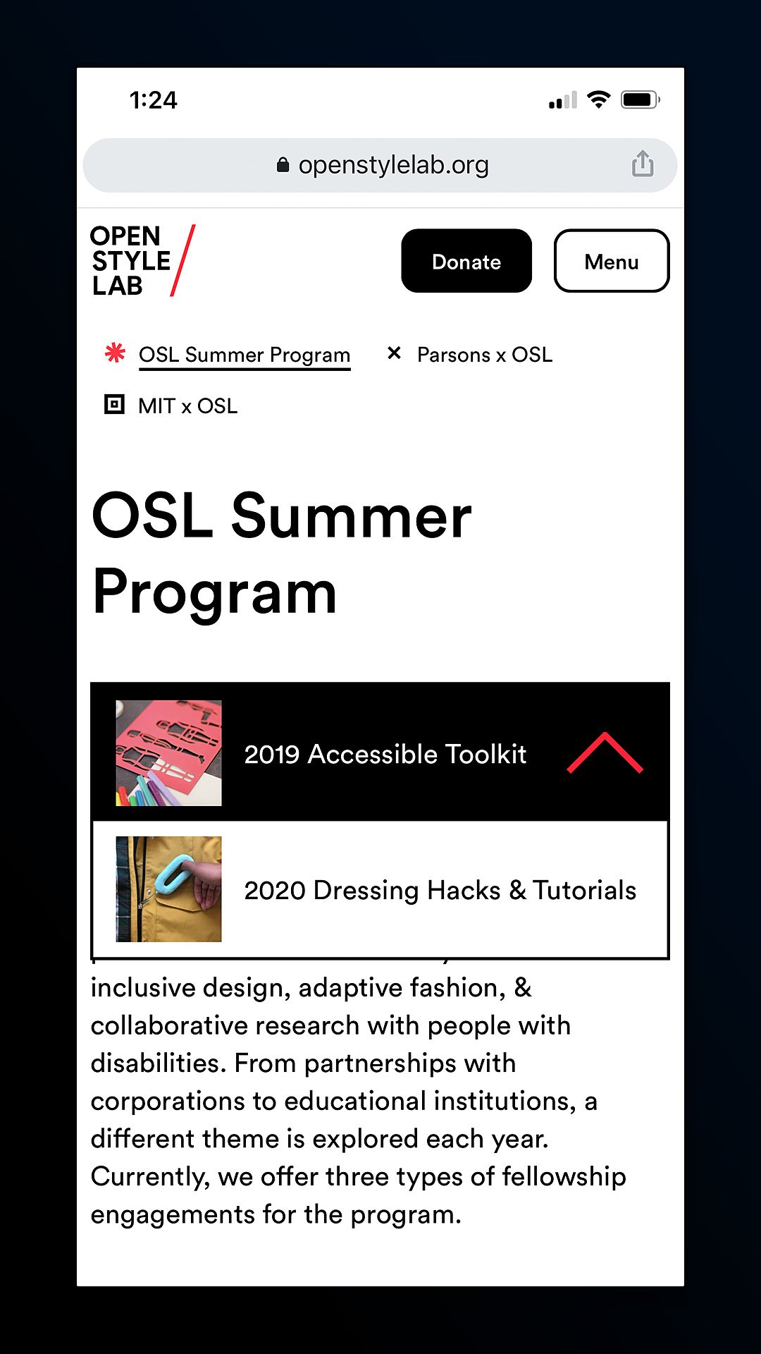
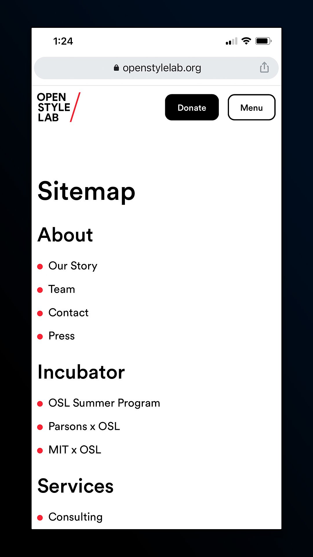
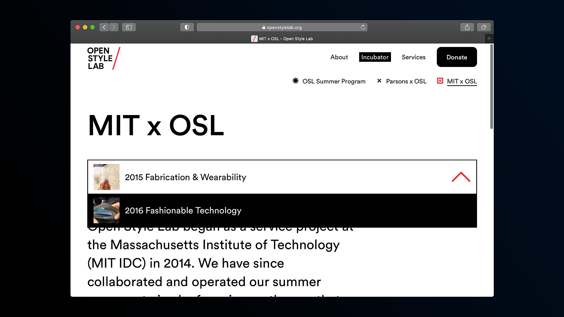
Scale expanded to prominent visual cues that highlighted context and interaction. To avoid adding extra details, we stuck with a controlled color palette of black, white, and red and worked within that system to showcase new information and exaggerated user interface details, such as drop downs and toggles
We also added a thumbnail view of the contents in dropdowns to add both text support and visual information to clue in users on what they’re going to navigate to.
